Mastering CTAs: Words, Color, Size, and Placement
In the world of online marketing, a well-crafted call to action (CTA) can be the difference between a visitor leaving your site and a visitor becoming a customer. Let’s dive into how words, colors, sizes, and locations of CTAs matter.
What Exactly Are Calls to Action?
A call to action (CTA) is any message intended to prompt an immediate response or encourage an immediate sale. But in the context of web pages, CTAs don’t exist in isolation; they’re influenced by surrounding elements.
Real conversion gains come from understanding customer needs, resonating with them through language, and offering valuable products. So, crafting a strong CTA involves more than just knowing your audience—it’s about relevance and perceived value.
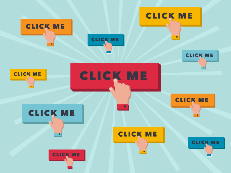
How to Design a Call-to-Action Button
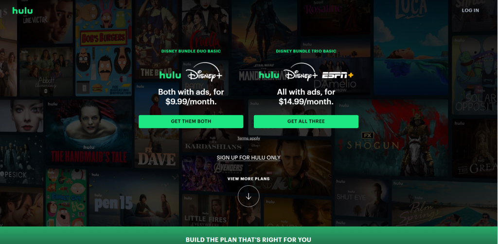
Consider Hulu’s homepage or Zoom’s interface. In both cases, the CTA stands out with high-contrast colors, attracting attention and providing a clear direction. But the color, size, or font alone isn’t the magic solution—how it interacts with other elements matters.
What to Call Your Call to Action
Choosing the right words for your CTA is crucial. Use trigger words that resonate with your audience. If users are looking for “pricing,” use “pricing” in your CTA. Avoid vague terms like “Submit” and opt for specific actions like “Sign up for a newsletter.” And remember, simplicity is key.
Don’t Rush Commitment
Most people are hesitant to commit, so avoid asking for big commitments upfront. Use terms like “Add to cart” instead of “Buy now” to make the action seem less final and more flexible.
Add Benefits
If your CTA is on a landing page, emphasize the benefits. For example, instead of just “Upgrade Now,” use “Upgrade Now: No Credit Card Required” to address customer concerns and add value.

Creating a Hypothesis for Your Call to Action
When crafting your CTA, ask yourself: What motivates my audience to click? What will they get out of it? These questions will help you form a hypothesis for your CTA design and copy.
Where to Put Your Call to Action
There’s no one-size-fits-all answer to where your CTA should go. It depends on how users consume content. You can use layout patterns like the Gutenberg diagram or F-pattern layout to guide placement, but remember, testing is key.

Conclusion
In summary, crafting an effective call to action involves understanding your audience, choosing the right words, design, and placement. But it’s not about copying what others do; it’s about testing and optimizing based on real user feedback. So, take a look at your CTAs and make them better now.